
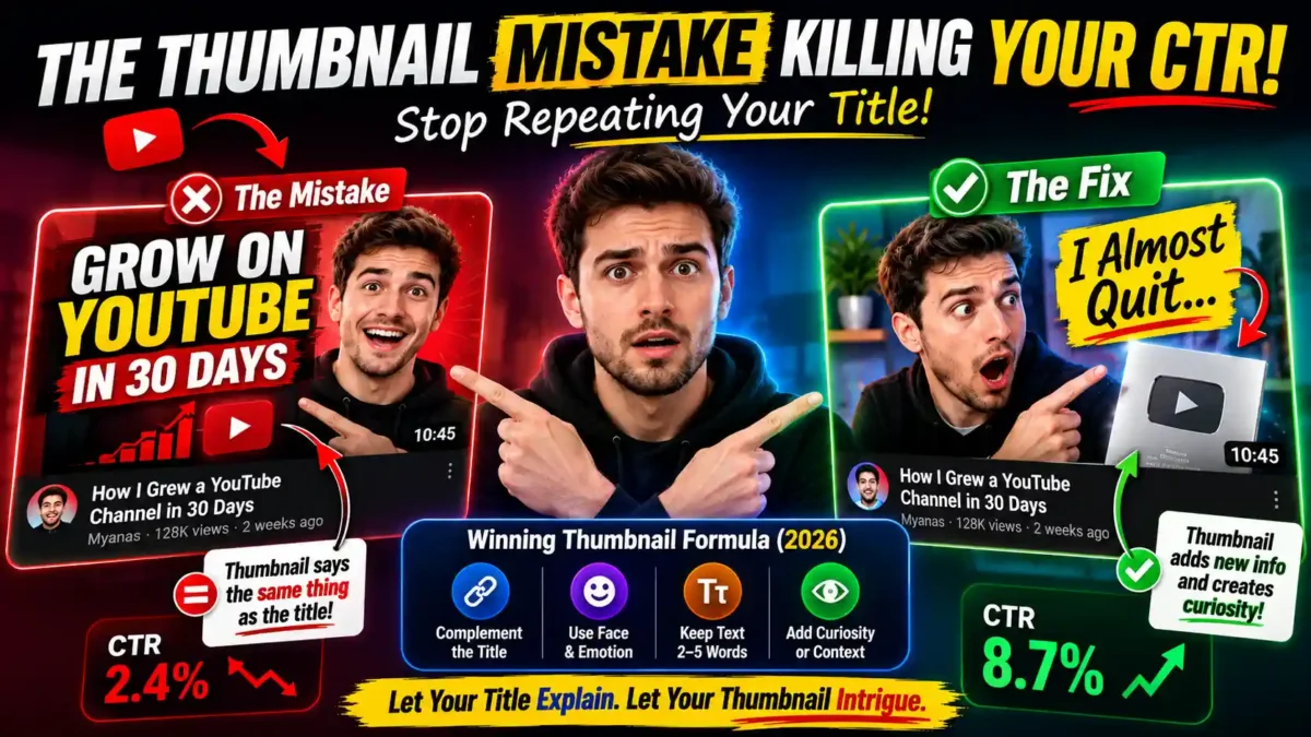

You’ve fixed the resolution. You’ve swapped in a face. You’ve even started A/B testing in YouTube Studio. And your click-through rate still won’t budge. If that sounds familiar, there’s a decent chance the actual thumbnail mistake killing your click-through rate isn’t a design flaw at all. It’s that your thumbnail is repeating your title instead of working alongside it.
Here’s the short version: when your thumbnail text says the same thing as your title, you’ve used up two chances to convince someone to click and gotten one message out of it. Fix that, and you free up real estate to add curiosity, emotion, or context your title doesn’t have room for. This guide walks through what redundant thumbnail text looks like, why it hurts CTR, how to fix it, and how to test whether the fix actually works for your channel.
What Does “Redundant Thumbnail Text” Actually Look Like?
Picture a video titled “How I Grew a YouTube Channel in 30 Days.” Now picture the thumbnail with the words “30 DAYS” plastered across it in bold yellow font. That’s the mistake. The thumbnail isn’t adding anything a viewer doesn’t already have from the title sitting right next to it. It’s just louder.
This happens because creators treat the thumbnail as a second title, a place to underline the main point one more time for emphasis. It feels safe. But YouTube’s own title guidance already pushes creators to keep titles succinct and front-load the important words, and if your thumbnail just echoes that same sentence in smaller, cropped text, you haven’t added a second reason to click. You’ve added noise.
Real-world examples of redundant thumbnails:
| Title | Redundant Thumbnail Text | Why It Fails |
|---|---|---|
| “How I Grew a Channel in 30 Days” | “30 DAYS” | Repeats the exact number in the title |
| “Is This the Best Budget Laptop of 2026?” | “BEST LAPTOP” | Repeats the two most prominent words |
| “Why Your Sourdough Isn’t Rising” | “SOURDOUGH TIPS” | Adds zero new information; title already covers it |
| “I Tried a $5,000 Camera for a Week” | “$5,000 CAMERA” | Same two facts, said twice |
| “The Truth About Passive Income” | “PASSIVE INCOME” | Repeats the subject without adding a hook |
If any of these look familiar, you’re in good company. This is one of the most common thumbnail mistakes across every niche and channel size, and it’s also one of the easiest to fix.
Why Does Repeating the Title Actually Hurt CTR Instead of Just Being Neutral?
Because attention on a search results page or home feed is measured in a fraction of a second, and a thumbnail that duplicates the title wastes that fraction on information the viewer already processed. Your title and thumbnail get scanned together, almost as one unit, and if both are saying “30 days,” the viewer’s brain registers it once and moves on. Nothing new got communicated, so nothing new pulled them in.
READ MORE
Contrast that with a thumbnail that shows an unexpected result, a shocked expression, or a single visual detail the title doesn’t mention. Now the title and thumbnail are doing two different jobs: the title explains what the video is, and the thumbnail creates a small, specific reason to want to know more. That gap between the two is where curiosity lives.
Think of it this way: Your title and thumbnail are two salespeople pitching the same product. If they both say the same thing, you’ve effectively hired one salesperson and paid for two. If they each bring a different angle, you’ve doubled your chances of making the sale.
One thing that stood out while researching this: several 2026 thumbnail guides independently landed on the same rule of thumb — keep thumbnail text under five words and make sure it complements the title rather than restating it. That’s not a coincidence. It’s the same underlying problem showing up across very different niches, from gaming channels to finance commentary.
What Should Your Thumbnail Say Instead?
Ask what your title already covers, then make sure your thumbnail covers something else. If your title states the topic, let the thumbnail show a reaction, a before-and-after, or a specific number or object connected to the payoff. If your title asks a question, let the thumbnail hint at the answer without fully giving it away.
A 2026 study from vidIQ that analyzed 500 breakout long-form videos across 30 niches found that 69% used a human face front and center, rising to 80% among the biggest overperformers, and 89% used either a face or high contrast. Among thumbnails that included text at all, the median was five words. That’s a strong signal that the winning formula isn’t more information packed into the thumbnail. It’s less information, chosen more carefully, so it doesn’t compete with the title.
What to put in your thumbnail instead:
- An emotional reaction the title doesn’t describe. (“I almost quit” instead of “30 days”)
- A before-and-after visual that implies a result. (Split image showing two states)
- A number that isn’t in the title but adds context. (“3 mistakes” when the title just says “mistakes”)
- A single object that represents the payoff. (A graph, a product, a tool)
- A short question that the title doesn’t ask. (“Was it worth it?”)
So what does that mean in practice? Keep your thumbnail text short enough that it reads as a fragment, not a sentence. Two or three words work better than five, and five works better than a repeated headline. Let the image carry the emotional weight. Save the specifics for the title, where a viewer has more time (and more space) to read them properly.
After looking at dozens of thumbnails across different channel sizes during research for this piece, the pattern that kept surfacing wasn’t clutter or bad lighting. It was this exact overlap — creators playing it safe by saying the same thing twice instead of trusting the title to do its own job. The channels that broke out of that pattern weren’t necessarily better designers. They’d just stopped treating the thumbnail as a caption.
How Can You Tell If You’re Making This Mistake Right Now?
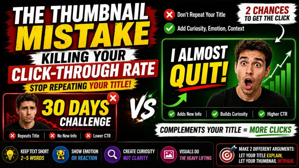
Pull up your last five uploads and cover the thumbnail with your hand while reading just the title. Then cover the title and look at just the thumbnail. If you learn the exact same single fact both times, that’s the tell. A thumbnail and title that are doing their jobs separately should each teach you something slightly different about the video before you’ve even clicked.
READ MORE
Here’s a quick audit you can run in five minutes:
- List your last five video titles. Write down the core message of each one in a few words.
- Look at each thumbnail separately. Write down what information the thumbnail communicates without the title.
- Compare the two lists. If the messages overlap almost completely, you’re making the redundant thumbnail mistake.
- Note which thumbnails have text that adds something new. Those are the ones to learn from.
| Title Says | Weak Thumbnail Text | Stronger Thumbnail Text | What the Stronger Version Adds |
|---|---|---|---|
| How I Grew a Channel in 30 Days | “30 DAYS” | “I almost quit” | An emotional stake the title doesn’t mention |
| Is This the Best Budget Laptop of 2026? | “BEST LAPTOP” | “Not what I expected” | A surprising outcome, not a repeated claim |
| Why Your Sourdough Isn’t Rising | “SOURDOUGH TIPS” | “One mistake fixed it” | A promise of a specific, actionable fix |
| I Tried a $5,000 Camera for a Week | “$5,000 CAMERA” | “Worth it?” | A question that invites a personal answer |
Once you’ve confirmed the overlap, the fix is usually quick. You don’t need to redesign the whole thumbnail — just swap the text for something the title hasn’t already told the viewer, and see if it changes anything before you commit to a bigger redesign.
How Do You Test Whether This Fix Actually Works for Your Channel?
Don’t guess. YouTube’s built-in A/B testing feature lets eligible creators upload up to three thumbnail and title combinations for the same video, and it picks a winner based on watch time rather than raw clicks, which matters because a thumbnail that’s technically less redundant but still misleading won’t hold up past the click.
Run one older, underperforming video through the test first. Keep everything else the same and only change whether the thumbnail text repeats the title or adds something new to it. That’s a cleaner signal than testing five variables at once.
How to set up a clean test:
- Pick a video that underperformed but that you believe is genuinely good.
- Create two thumbnails: one with the original redundant text, one with complementary text.
- Keep the title identical in both tests. You only want to isolate the thumbnail text variable.
- Run the test for at least 7–14 days. Short tests produce noisy results.
- Check the winner based on watch time, not just CTR. A misleading thumbnail can inflate CTR while hurting retention.
If you want a broader read on what’s showing up across thumbnail data this year beyond just this one mistake, vidIQ’s 2026 thumbnail design research is a reasonable place to look, since it’s based on an actual sample of breakout videos rather than general advice.
Other Thumbnail Mistakes That Often Get Confused With This One
It’s worth separating redundant text from other thumbnail problems, because they have different fixes.
READ MORE
- Low contrast. If the thumbnail doesn’t read at a small size, no amount of clever text will save it. Fix: test your thumbnail at 20% zoom before uploading.
- Too many competing elements. Three faces, four text blocks, and a busy background all fighting for attention. Fix: pick one focal point.
- Text too small. Anything under 30% of the thumbnail height is likely unreadable on mobile. Fix: make the text bigger and shorter.
- Misleading imagery. A thumbnail that promises something the video doesn’t deliver will get clicks but destroy retention and trust. Fix: align the promise with the content.
- Missing emotional signal. A flat, neutral image gives no reason to click. Fix: use a face or a strong visual cue that hints at a reaction.
Redundant text is a specific problem with a specific fix. The others above have their own solutions, and fixing them all at once usually produces a better thumbnail than fixing just one.
How to Write Better Thumbnail Text in 5 Minutes
If you’re staring at a blank thumbnail and don’t know what to write, use this process:
- Write the title first. Get it as clear as possible.
- Circle the one idea the title communicates best. That’s off-limits for the thumbnail.
- Ask: what else is true about this video? Write down three additional facts, emotions, or outcomes.
- Pick the one that creates the most curiosity. That becomes your thumbnail text.
- Cut it to three words or fewer. If it doesn’t fit in three words, the idea is probably too complex for a thumbnail.
This takes about five minutes per video and consistently produces better results than copying the title into the thumbnail and calling it a day.
Frequently Asked Questions
Does thumbnail text even matter if my title is strong?
Yes, but only if it’s doing something the title isn’t. A strong title with redundant thumbnail text still wastes half the available attention. A strong title paired with thumbnail text that adds a new detail gives you two separate hooks instead of one repeated hook.
READ MORE
Is it better to have no text at all on a thumbnail?
Not necessarily. No text works fine when the image alone tells a clear, specific story. But a short, well-chosen fragment of text can still add curiosity that an image can’t communicate on its own, like a number, a reaction, or a twist.
How many words should thumbnail text actually be?
Recent 2026 thumbnail research points to a median of around five words when text is used at all, with top performers often trimming that down to two or three. The point isn’t hitting an exact number — it’s making sure every word earns its place instead of repeating the title.
Will fixing this mistake alone fix my click-through rate?
It won’t fix everything on its own if your thumbnail also has resolution, contrast, or misleading-content problems. But for channels with otherwise solid thumbnails and titles that still can’t get their CTR moving, this overlap is one of the more common and most overlooked culprits.
Should I check my past videos or only fix new uploads?
Both, but start with your underperforming older videos. You can update thumbnails and titles on existing uploads without penalty, and it gives you a low-risk way to test the fix before applying it to new content.
Does YouTube’s algorithm penalize thumbnail changes?
No. Updating a thumbnail or title on an existing video doesn’t trigger any penalty. In fact, YouTube’s own A/B testing tool is designed to help creators experiment with thumbnails, which implies the platform expects and encourages changes.
What if my niche doesn’t use faces in thumbnails?
The face data is an average across niches, not a rule. If your niche works without faces (for example, finance charts or gaming setups), focus on high contrast and a single clear focal point instead. The redundant-text problem applies regardless of whether a face is used.
How long should I wait before judging an A/B test result?
At least 7 days, ideally 14. Shorter tests are noisy because small samples can produce misleading results. The longer the test, the more reliable the signal, as long as the video keeps getting impressions.
The Takeaway
The thumbnail mistake killing your click-through rate usually isn’t the one that shows up on every “top 10 mistakes” list. It’s quieter than that. It’s the habit of using your thumbnail to repeat what your title already said, which means you’re only ever making one argument for the click instead of two.
Separate the jobs. Let your title explain and your thumbnail intrigue. Test the change on one video before you roll it out across your channel. And when in doubt, ask yourself what your thumbnail teaches the viewer that the title doesn’t. If the answer is “nothing,” you’ve found the mistake.



Leave a Reply